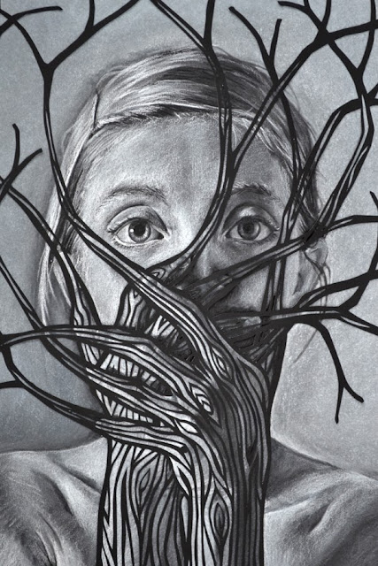
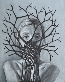
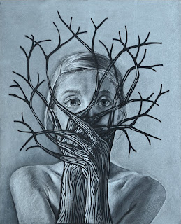
The idea for the medium of this piece came from a small mistake. I was editing "Embrace" in Photoshop. It's a graphite drawing combined with a white paper cut. I accidentally hit the key command to invert the image (so black became white and white became black.) All of a sudden it looked like a white chalk drawing on black paper, with a black paper cut on top. BAM, idea hatched.
I first drew with white chalk on black paper in high school, and fell in love instantly. For those of you who don't know much about drawing, drawing with white on top of black is like drawing in reverse. Instead of marking where the darker areas are, you mark where the light is.
So here is what I ended up with:
 |
| "Merge" 16"x20", chalk and charcoal on black paper, hand-cut paper, by Heather Clements, 2013. |
 |
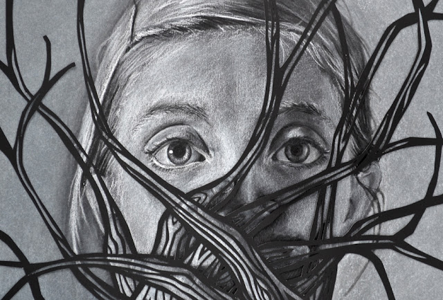
| "Merge" (detail) 16"x20", chalk and charcoal on black paper, hand-cut paper, by Heather Clements, 2013. |
 |
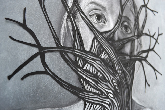
"Merge" (detail) 16"x20", chalk and charcoal on black paper, hand-cut paper, by Heather Clements, 2013.
|
 |
"Merge" (detail) 16"x20", chalk and charcoal on black paper, hand-cut paper, by Heather Clements, 2013.
|
Here was the drawing before I added the paper cut:
Then I created a paper cut layer that I ended up not using. It was too bold and thick. It completely flattened the arms and hands, obscuring the individual fingers. So I decided to scrap that paper cut and create another one with finer lines and more detail. I am so glad I did, because with the new paper cut the hands kept their depth and the finer lines worked so much better on top of the drawing. Below you'll see the first version on the left, and the second and final one on the right.
 |
| BEFORE |
 |
| AFTER |
MUCH better, right?
In other news, I broke 500 likes on my
Facebook page! Woohoo! Thank you to all who have liked my page!
Inspiration Source #20: THIS:
Thank you, people of the internet, for spending some time here with me on my art blog.
-Heather

